Ecomm 2.0

Redesign

Product
Vaccines e-commerce
My role
As a product designer, I performed user research, facilitated ideation and validation sessions, usability testing, prototyping, and design handoff.
duration • Modality
3 months • Remote only
Product
Vaccines e-commerce
My role
As a product designer, I conducted user research, benchmarking, and information architecture analysis. I created low fidelity wireframes, facilitated ideation and validation sessions, performed usability testing, and prepared design deliverables.
duration • Modality
3 months • Remote only

Company and Product

DASA is the fourth biggest company in the world in the Diagnostic medicine segment.

The vaccine e-commerce website was launched in September 2020 as a marketing initiative, and I worked as a Product Designer on the project from March 2021 to July 2022.

Our value proposition is to provide a faster vaccination experience at any of DASA's 19 different laboratories brands, allow for easy price comparison, and establish credibility.

Briefing
Redesign e-commerce for brand consistency and higher conversion rate.
Create home care scheduling flow for patients.

Research

User research was divided into two parts: understanding user behavior on our website, and analyzing how our primary competitors structured their information architecture.

The main goal was to gather actionable information that could serve as a foundation for all of our design decisions.

DIBB framework

To turn data insights into actionable design decisions during the user research phase, I often use the DIBB framework as a deliverable.

The data was gathered from:

Google Analytics
Hotjar Survey
Hotjar recordings
Braspag Report

Data

Insights

Beliefs

Bet

XX% of our users select the same date when more than one vaccine is added to the shopping cart. XX% select the next available day, and XX% select a date within one week from the purchase date.
The following six available dates should be prioritized over the date selection from a schedule component.
By optimizing the user flow and reducing friction in key interactions such as date selection, we will create a more streamlined and user-friendly user experience overall.
Increase our conversion rate by decreasing the number of interactions in the conversion flow.
When having more than one vaccine on the shopping cart, XX% selected the same unit.
Data indicate that unit selection should be made only once for all vaccines added to the shopping cart.
Cases in which the user selects more than one unit should be treated as exemption scenarios.
Increase our conversion rate by decreasing the number of interactions in the conversion flow.
XX% of all single-session purchases had only one product added to the shopping cart.
Data show an opportunity to incentivize the selection of more products.
Informing about the possibility of getting a progressive discount during the product selection phase can increase the number of items bought in a single session.
Increase the number of products added during a session. Increase sales volume.
During 2021, exploratory navigation pages had a considerable volume of page views. Also, the Hotjar survey pointed out that users were getting into the website without knowing what vaccine they would buy.
We have a high demand for exploratory navigation.
Information architecture needs to support vaccine discoverability and information regarding the product.
Increase the conversion rate of users who enter the website to learn about vaccines while providing a shorter flow for users who already know what vaccine to buy.
High bounce rate on e-commerce home page. Most users are directed from the company laboratory's websites
Lack of dialogue between websites. Illustration, typography, color palette, microcopy, and interaction patterns differed.
Following the visual identity and interactions from the company lab sites, we can create seamless navigation between products.
Decrease the bounce rate and increase the number of users that complete our conversion funnel flow.

Information Architecture Analysis

My main focus was to understand how our primary competitors structured their information architecture. In hindsight, it would have been interesting to include products from outside the healthcare sector in the analysis.

To analyze the structure, I used colors to refer to the type of information displayed and blocks to refer to different pages. I only analyzed the main conversion flow.

User-flow definition

Comparison between As Is (first) and To Be (second).

Low-fi wireframe
I utilized low-fidelity wireframes during ideation sessions to translate insights from the user research phase into tangible designs, and validate them with stakeholders. I also conducted initial usability testing with company employees from various departments to refine the flow before conducting testing with end users.
Hi-fi wireframe &
usability test
It followed the company Design System called ALMA.
All pages had a clear hypothesis stated to be tested with end users. I brought the screen flow to a Miro board where PD, PM, and UXR could provide their observations for the team to decide what needed to be adapted before I could start working on the handoff.

Product listing

I presented two versions of the product listing page. Only the first version was brought to high fidelity and tested with end users. The second version got into our design backlog.

The first version was designed to support objective navigation. Therefore, we included chips to supplement the search as a filter.

The second version was designed to support exploratory navigation. Our goal was to create CMS pages for each category that would cater to its specific information needs. These pages would be accessible from the homepage and allow users to explore the available products and services.
Low-fi wireframe
hi-fi wireframe
Before redesign
Low-fi wireframe
hi-fi wireframe

Unit selection

Flow before redesign:
For each vaccine selected user would have to choose a unit.

Reason:
it follows a typical e-commerce flow, as presented in previous benchmarks. In an e-commerce flow, we have a product selection and a product variation selection. For instance, a t-shirt (product) and a t-shirt size (variation). In our case, a vaccine (product) and a unit (variation).

Redesing Proposal:
Only allow the user to select a unit after selecting all vaccines. This way, we can ensure that the user will choose all vaccines on the same unit, thus allowing for a seamless home care flow.
Low-fi Wireframe
Hi-fi wireframe - service selection
Hi-fi - lab selection - home care
Hi-fi - lab selection - Presential
Low-fi Wireframe
Hi-fi wireframe - service selection
Hi-fi - lab selection - home care
Hi-fi - unit selection

Shopping cart page

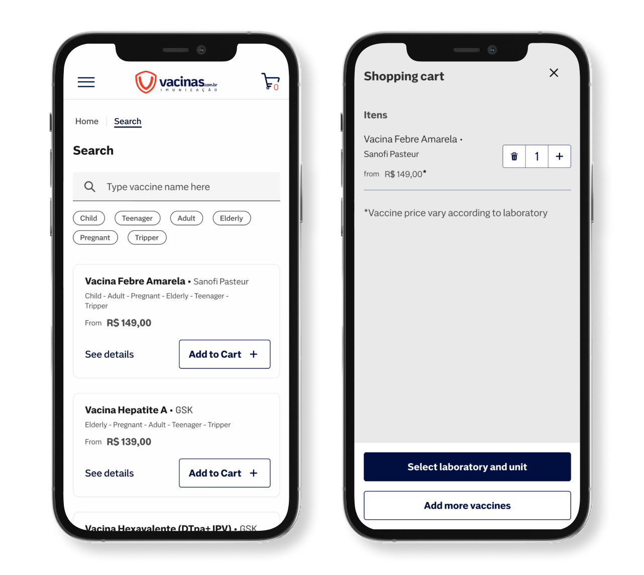
On the shopping cart page, the user needed to select/input the following:
1- Date.
2- Vaccine beneficiary.
3- Input beneficiary info.

Shopping cart interactions and information have been broken down into 4 different pages.

Before redesign
Sub cart page
beneficiary selection page
order summary page
Handoff
I opted to use an adaptative layout with mobile, tablet, and desktop breakpoints.
I did all documentation following DASA's Design System guidelines.
I linked all team and DS components to their respective libraries.

Let's work together!

Send me your information and we will get in touch!

Thank you! Your submission has been received!
Oops! Something went wrong while submitting the form.